
Dithering, explained for designers
August 3, 2026 · 1 min read
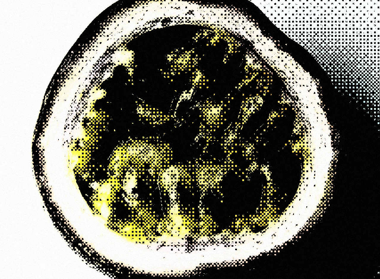
Dithering comes from early computers. Screens could only show a few colors, so software scattered pixels of the available colors to fake the missing shades. From a distance the scatter blends into smooth tone. The hack is no longer needed, but the look stayed.
Why designers use it
- It looks digital on purpose. Grain suggests film. Dither suggests machines. That makes it a good fit for dev tools, electronic music, games, and other technical subjects.
- It creates texture. A dithered gradient has visible structure up close and reads as a smooth blend from a distance.
- It simplifies. Reducing an image to two or three colors forces a clear graphic read, similar to halftone.
Using it well
- Give it contrast. Dither needs clear lights and darks to form a pattern. Adjust contrast before applying the effect, not after.
- Choose the palette deliberately. Black and white is the classic look. Indigo on cream or green on black point back to old terminals. The two colors you pick carry most of the design.
- Mind the scale. The pixels should stay visible. If the image is scaled down until the pattern disappears, the texture is lost. Export at display size.
- Keep the typography clean. The pattern is busy, so the type around it should not be.
Try the look
The Pryzm studio has dithering built in. Feed it a gradient or a photo and tune the pattern live.
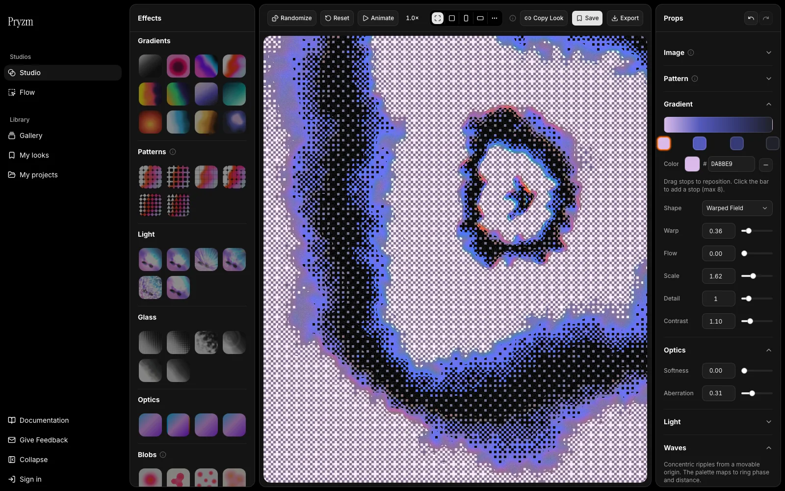
The looks tagged Dither in the gallery are ready to use. Open one, recolor it, and export.