
Glassmorphism backgrounds: getting the frosted-glass look right
August 1, 2026 · 1 min read
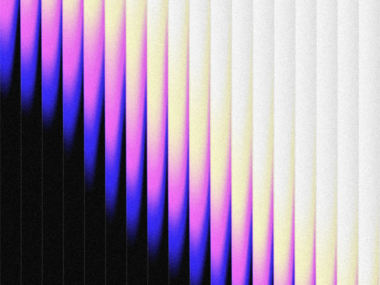
Glassmorphism is the frosted panel look: a blurred, semi-transparent card floating over a colorful background. Most attempts fail at the background, not the panel. Frosted glass blurs whatever is behind it, so if the background is plain, the effect has nothing to show.
The background does the work
A glass panel over a flat grey page looks like a lighter grey rectangle. The effect needs color variation behind it: soft shapes, blobs, or a gradient with a few distinct colors.
- Use 2 to 4 saturated colors on a dark or light base, arranged as soft shapes instead of one even wash.
- Keep the shapes large. Small details disappear under blur. Big color fields stay visible.
- Add a little grain. A touch of noise keeps the blur from looking like a plain filter.
Readability rules
Glass panels usually hold text, so contrast matters twice: the panel against the background, and the text against the panel.
- Keep the area behind your main panel calmer than the edges.
- Avoid placing your brightest color directly under white text.
- Test at mobile width. A blur that looks subtle on desktop can lose all definition on a small screen.
Making one fast
The Pryzm studio has a glass effect built in: build the colorful base first, then pull the glass slider up until the shapes melt into each other.
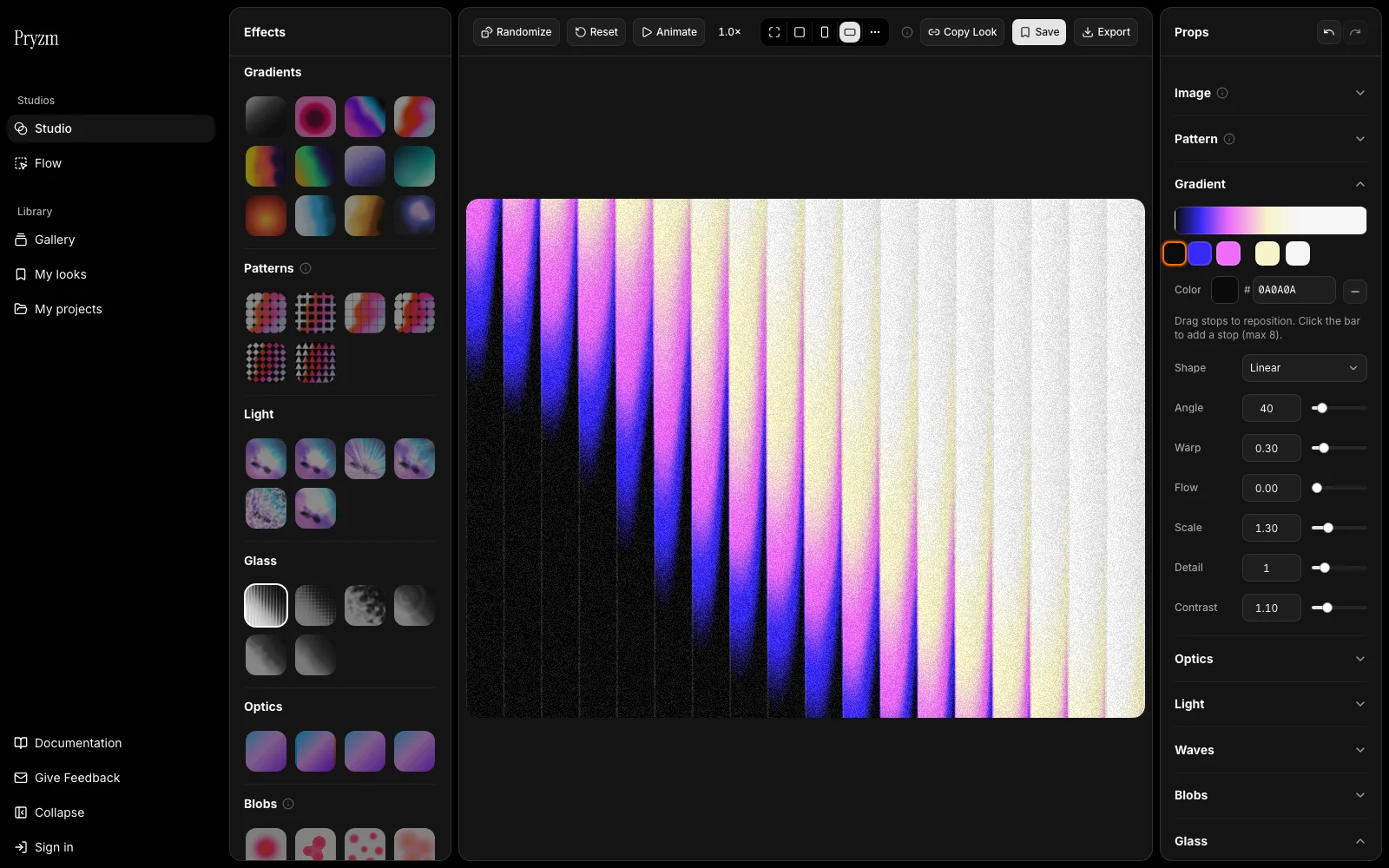
Looks tagged Glass in the gallery are ready starting points. Open one, swap the colors for yours, and export.
The finished background is a normal image, so it works in any stack. Place it behind a semi-transparent panel with a backdrop blur and you are done.