
Hero section background ideas that don't look like a template
August 1, 2026 · 1 min read
The hero background sets the tone of a page before anyone reads the headline. Here are six directions that work, and one rule that applies to all of them.
Six directions
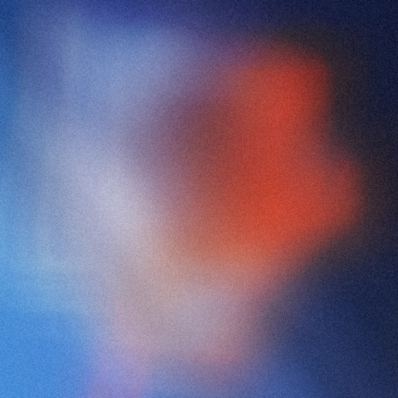
- A grainy gradient. Two muted colors, one accent, film grain on top. It feels warm and finished, and the grain prevents banding on lower-quality displays.
- Dark with one glow. A near-black field with a single soft light source. White text stays readable, and dark product screenshots blend in naturally.
- Frosted color fields. Large saturated shapes melted together with a glass blur. Colorful without being loud, and a good base for glassmorphic UI panels.
- A halftone image. A photo or gradient pushed through a dot screen. It has print character and suits portfolios, agencies, and event pages.
- Dithered texture. A two-color pixel dither. It has a technical, retro-digital feel that fits developer tools and music projects.
- A slow animated loop. Any of the above with slight motion. Keep it slow enough that it never competes with the content.
The rule that makes all six work
The background must not fight the headline. Keep the busiest details away from the text block, check contrast at mobile width, and when in doubt darken the area behind the type a little.
Steal a starting point
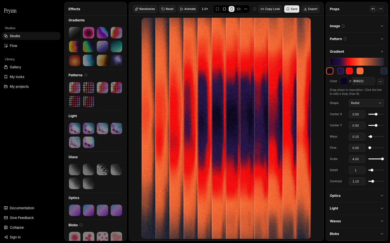
Every direction above exists as a working look in the Pryzm gallery. Open one in the studio, swap the palette to your brand, and export it at your hero's exact aspect ratio.